The CatDV Web 2 interface can be extensively customised through the use of Web Workspaces. A Web Workspace is a collection of settings that allow control over amongst other thing:
- Theme – the colours and logos used in the interface
- Navigation – which navigation options are available (browse catalogs, complex search etc.)
- Clip Operations – which operations a user is allowed to perform on selected clips (creating/editing sequences, sharing links to clips etc.)
- Import/Export – whether the user is allowed to upload or download media to and from the server.
- Shopping Basket – whether the shopping basket functionality is available
- Labels – override the names displayed for certain elements e.g. rename Catalogs as Collections.
Web Workspaces are managed in the Web Workspaces section of the Web Administration interface.
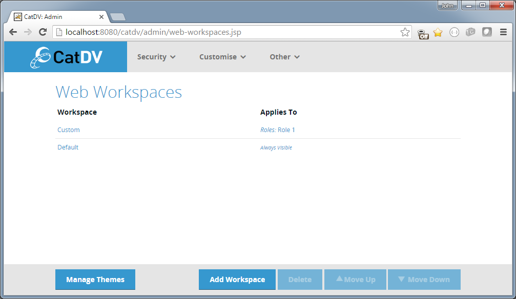
It is possible to define multiple Web Workspaces and set visibility rules for each one to control which workspace is applicable to different users.
Note that the order of the workspaces in the list is significant. The system starts at the top of the list and evaluates the visibility rules (settable through the link in the Applies To column) and if the rules match that workspace is used. If not then the next workspace in the list is tried. If no workspace matches then the default settings are used.
In the example above the last workspace ‘Default’ has visibility set to ‘Always Visible’ so will act as the fall-back workspace that will be used by the log in screen – when the current user has not yet been determined.
Workspace Editor
Clicking on the name of the workspace or clicking Add Workspace brings up the Web Workspace Editor:
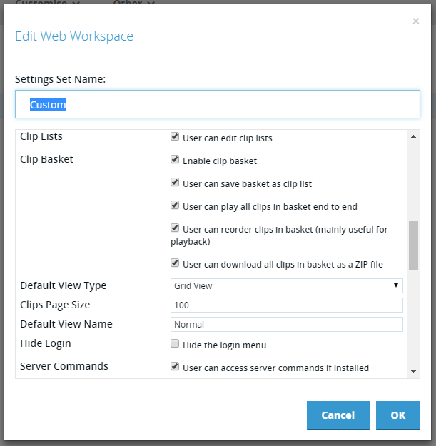
The name of the workspace can be set in the name field and the other settings can be set in the scrollable panel below. The settings themselves are hopefully fairly self-explanatory.
Custom Themes
The first item in the Workspace Editor settings list is the UI Theme. A theme is a collection of images and stylesheet values that control the visual appearance of the web interface.
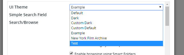
The user can select a theme for the workspace from a list of available themes.
By default the only themes available are Default and Dark, but it is possible to create new themes using the theme editor.
To manage the available themes click on the Manage Themes button in the footer of the Web Workspaces screen. This displays the Manage Themes page:
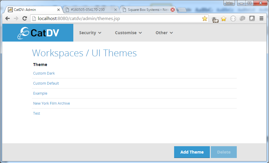
Note that the built-in themes Default and Dark do not appear in this list – only custom themes created by the user.
Theme Editor
Clicking on the name of one of the custom themes or clicking the Add Theme button brings up the Theme Editor. The Theme Editor has three tabs that allow editing of the images, main theme colours and advanced theme colours.
Theme Images
The Images tab allows a directory to be specified where the images for the theme will be read from.
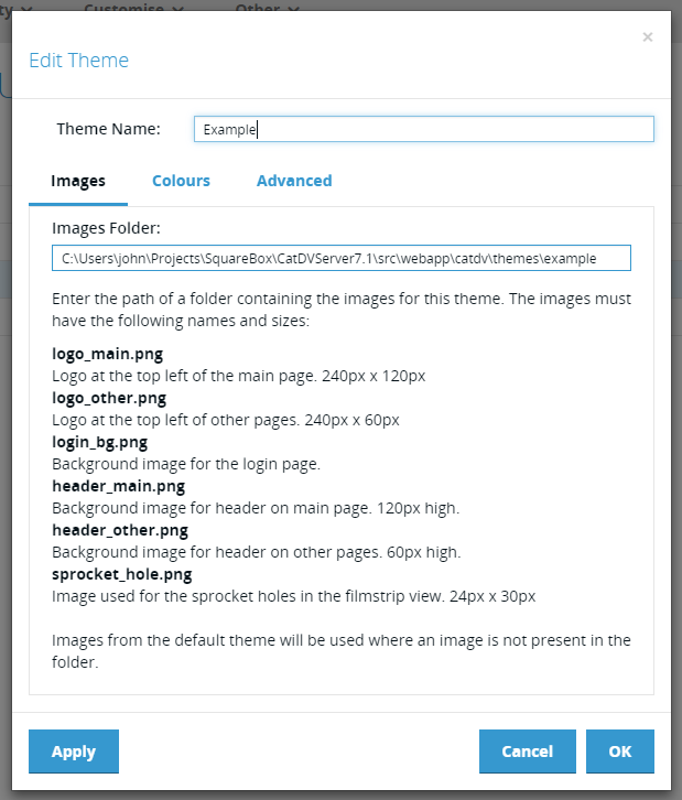
NOTE: the directory must be readable by the user running the CatDV Server service/daemon.
Within the directory can be placed up to six images:
- png – logo at the top left of the main page. 240px x 120px
- png – logo at the top left of other pages. 240px x 60px
- png – background image for the login page.
- png – background image for header on main page. 120px high.
- png – background image for header on other pages. 60px high.
- png – image used for the sprocket holes in the filmstrip view. 24px x 30px
The images must use the exact names specified and must be of the size specified.
It is not necessary to provide all of the images listed. The theme will fall back to the images from the built-in ‘Default’ theme for any images that are not present in the specified directory.
Main Theme Colours
The Theme Colours tab allows the colours of the main user interface regions to be defined. The regions are:
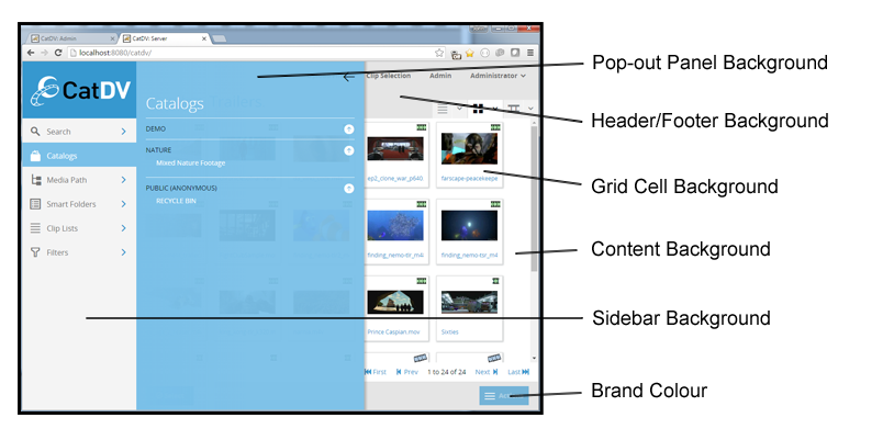
The current colour for each region is displayed in the background of associated colour picker along with the CSS hexadecimal representation:
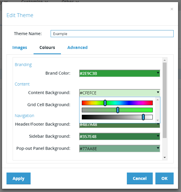
Colours may be edited either by entering a new hexadecimal value or using the colour picker accessed via the drop down arrow. This allows the colour to be created by setting hue, saturation and brightness values via the associated sliders.
Advanced Theme Colours Tab
The colours that are defined in the Colours tab are principally the background colours for the various UI regions. Normally the corresponding foreground colours are set automatically depending on the background colours chosen. The Advanced tab allows these foreground colours to be overridden if required.
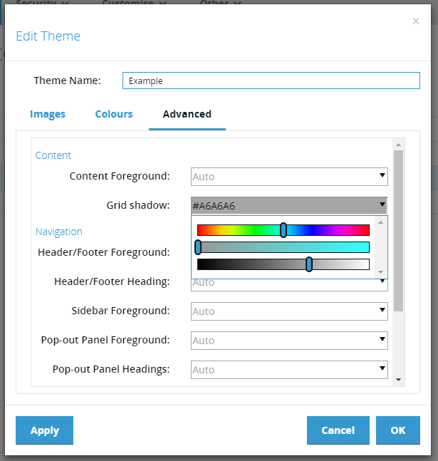
By default all the values in the “Advanced” tab are set to ‘Auto’, which means the values will be calculated by the theme generator. However it is possible to override these automatic values either by entering a CSS hexadecimal colour value or using the colour picker HSL sliders as in the “Colours” tab.
To reset the field to “Auto” simply delete the hexadecimal colour value.